Monday, April 29, 2013

Picturlicious!

All right, one more post before the vacay.

This one has absolutely nothing to do with home improvement or home design, but it is about DIY!!!

This little nugget of info changed my life...okay, not really, but it did give me the giddies.  I just now figured out how to manipulate my template to allow for ginormous pictures on my blog.  I'm sure many of you have been aware of this "blog changing" info for awhile, but there's no need to hate.  Some people {namely me} just move at a slower pace.

Anywho, for those of you have admired the big, luscious pictures on all of your favorite blogs and wondered "how do they do that" well, today is your lucky day because I'm going to fill you in.

To begin:
click on design tab in the upper right hand corner of your home page...on the navigation bar.


Then, click on the orange icon that says customize, you wil find it just below the "live on blog" image.

On the left hand side of the page, you will see a list.  Click on adjust widths.


You will notice now, that you can adjust the widths of both your entire blog, and your side bar.
 

The standard for my blog was 960 px for my entire blog width, and 310 px for my {right} sidebar.  I simply readjusted the total width to 1100 px and reduced the sidebar width to 300 px.  

This seemed to be the perfect size for allowing me to enlarge my photo uploads to extra large, without encroaching on my sidebar or distorting the picture.

You may want to play around with your widths a bit to find your ideal number, but once you do it will be totally worth it, because then you will have become a member of the "lusciously large picture" club.

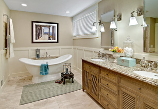
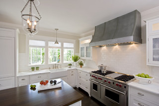
Here's how big my photos were before

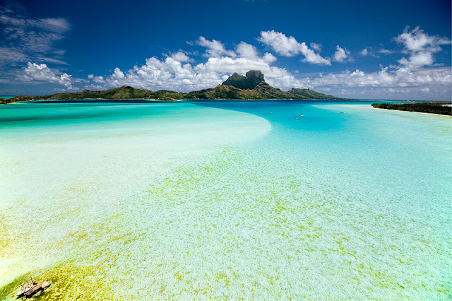
And here's how luciously large they are now.

Life changing right?  You're welcome!

Be good while I'm gone.  And I'll see ya when I get back.
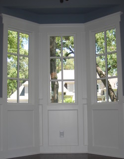
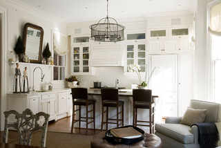


Saturday, April 27, 2013

A change of mind AND a cheap, easy, awesome accent wall idea.

I mentioned in my last post how much I love white walls and how I was all jazzed up about painting one in my house.  

Well, I still love white walls and I still will paint a white wall in my house...I have 2 gallons of white paint sitting on my counter to motivate me.  But for the project I just finished, I decided a slightly off white wall would work better.

The color on the wall is Realist Beige by Sherwin Williams.
{SW6078}

I know, I know.  Why would I want boring beige on my walls,  but trust me, this beige is cool and creamy and doesn't come off as drab at all.  It is a great accompaniment to the gray and white accents I already have in the space.

Anyway, enough about all that.

I have been wanting to do an accent wall in my front room for awhile, but I didn't want to just slap some paint on it and call it good.  I wanted to do something that was graphic and interesting and different.  After much thought and consideration I decided on this...
Umm, yes.  Those would be gold, dot stickers.  You probably think I'm crazy right about now, but just trust me.  I purchased this roll of 1000 dots for $10 on Amazon.com.

Here's what happened when I stuck {almost} all of them on the wall.
I actually really dig it.

I think it's interesting and eye-catching, without being obnoxious.  And it's gold.  Who doesn't love gold?  Not me, that's who.

When the light hits the dots, they make the wall sorta sparkle and come alive.

Gold is one of my favorite accent colors right now, so I am super thrilled about having a gold accent wall.  Did I mention how much I like gold?


I didn't really follow any plan or pattern except that I wanted to give the illusion of the dots floating away, so I started really condensed at the baseboard and then gradually spread the dots out as I moved up the wall.

Not bad for a roll of stickers, eh?  And I bet you didn't even remember the fact that my wall is {not} boring beige instead of white.

In other news, Studs and I leave for our vacay in a couple of days.  I will try to get another post in before I head out, but just in case I don't, I'll see you in a week.


Wednesday, April 24, 2013

Which white is right?

I've been trying to bang out a couple of little projects around the house before Studs and I head out on our vacay next week.  

This last weekend I painted the kitchen nook and a focal wall in the great room a deep charcoal grey color.

{don't mind "lil red" there takin' a snooze}

I love how it turned out.  Charcoal grey is such a sophisticated color.

I find it interesting how the space feels brighter with this darker color on the walls.  Not sure why that is...I imagine it might have something to do with the way the white shelves really pop against it now.  

Anyway, now I'm on to my next project.  This one involves painting a white wall {and a little extra sumthin-sumthin}.  If you haven't noticed, white is all the rage right now and I am totally drinking the Kool-Aid.  I think white rooms look so crisp and clean and open and bright and...
But it can get really overwhelming trying to hone in on just the right shade of white.  There are so many different "whites" out there to choose from.  So, I did a little homework and thought I'd share it with you just in case you were contemplating painting a white wall in your house too.

I narrowed down some choices of whites that are tried and true.  I tried to include options from varying price points and easily accessible brands.  Also, I've included the link to a great article I happened across on Houzz {I could go on and on about this website, but that's for another post} that addresses the topic of choosing the right white for your space.

#1
Creamy by Sherwin Williams
{SW7012}
I used this color to paint my kitchen cabinets.  

It doesn't look as off white in person as it does in the swatch above.   It's just a deliciously warm, soft, white color.  Color shown in the wainscoating below.

#2
Snowbound by Sherwin Williams
{SW7004}

I used this color on the doors and trim in my house.  
SHERWIN-WILLIAMS SNOWBOUND 7004
It is a really cool and crisp white, but not so stark that you need to wear sunglasses when you look at it.  Color shown in the wainscoating and trim below.

#3
Atrium White by Benjamin Moore
{PM-13}
This color comes highly recommended although I have never used it personally. It's described as being not too warm and not too cool, but just right.

Color shown on the trim below.

#4
Dove White by Benjamin Moore
{OC-17}


Color shown below
This is another white that comes highly recommended.  It is the perfect neutral white...not too gold and not too gray.

#5
Anthem White by Valspar
 {7006-24}
#6
Decorator's White by Benjamin Moore
{CC-20}

#7
Swiss Coffee by Behr


Something to bare in mind when choosing a white, is to consider the style and aesthetic of the room  whose walls are being painted.  You might also take into account the overall aesthetic of your house.  If you lean towards a more modern aesthetic, you might steer clear of warmer, 
antique-y, off-whites and choose a "newer", crisper white.  The same would go for an older home.  A bright stark white wouldn't look as good as a warmer, "aged" white.
As for me, my home is neither modern nor old, it's somewhere right in the middle.  So, I've decided to go with a perfectly neutral white.  

Here's to hoping I've chosen, white-ly, I mean wisely.    :)


Saturday, April 20, 2013

Mommypage.com Feature

Good morning, friends!

Not sure how things are in your neck of the woods.  It's a bit wet and rainy in these parts.  I don't mind the rain if I can sit inside sipping hot cocoa and watching Bath Crashers...the T.V. show, not my real life drama.  But I do mind when I have to head out to a soccer game and sit in if for an hour.  Fingers crossed the wetness stops and is completed evaporated in an hour.

Anywho, a few months back, I was contacted by someome from the blog...mommypage.com asking if they could feature me and my little blog.  I was a bit surprised, as my blog is not really a big deal...more of my online diary/idea book.  But, I happily agreed.


Anywho-anywho, my feature was just posted {I discuss how Retropolitan came to be, where I find my inspiration and give a few tips on how you can quickly and inexpensively liven up your home and make it feel fresh again}.
  

So for those of you not familiar with mommypage.com, please do me a solid and help me show them some love by heading on over and checking them out.  They've got other really great articles and links on all sorts of "mommy" related topics -recipes, crafts, coupons, testimonials... 

And...

In other news, Studly recently found out that he won a trip to...Bora Bora {we leave in a week and a half}.  Holy crap!  Where is that even?  Whatever, I will look at a map later.  But, can you believe it?  


I don't think I've ever seen a place so beautiful.

I would be over the moon excited, I mean I am over the moon excited about it.  But I'm a little anxious about leaving my five, crazy kiddos and then flying for ten hours.  I only have a two, deep to the core, fears...snakes {anything appendage-less} and heights /falling from great heights {here's where the flying thing comes into play}...oh, and bumping into David Beckham in my mommy pants, sans make-up.  

Any tips from you seasoned travelers on how I can knock myself out for ten hours straight, so I'm not "white knuckling" it through the entire flight?  


Thursday, April 18, 2013

Pillow Talk

Let it be known that I love toss pillows.  

I'll save you all the lengthy dissertation on how obsessive personalities run in my family and how I tend to get fixated on certain things...uh hum, David Beckham anyone?

Anyway, I just love accent pillows.  I especially love having extras on hand that I can pull from when I am feeling the need to switch things up.

That all said, I thought I would share one of my favorite tips for making pillows...cloth napkins {and kitchen towels}.

Not only are napkins {and towels} the perfect, pre-formed size for accent pillows, they also tend to offer a wide variety of interesting patterns and colors.  Oh!  And they are also really cheap.  Cha-ching.

I recently came across this brightly colored dish towel.  Only I didn't see a dish towel, I saw the perfect accent pillow for my bed.
There was no cutting and no hemming involved...just sewing four straight lines {and if you don't sew, there are all sorts of liquid stitch and heat activated options you could try}.  What could be easier than that?

Voila!  A beautiful, bright and one of a kind pillow that took all of fifteen minutes to make {probably less if I wasn't using the world's crappiest sewing maching}.


And for your inspiration...

I saw these napkins at West Elm, a set of four for $20.  That works out to be $10 per pillow, or you could always add a contrasting color to the back of each and make four pillows for a little over $5 a piece.  Ba-Bam!
 I think I love the dark pink best.

And who doesn't love a playful polka dot...especially those of the "ikat-y" variety?
These napkins, also from West Elm retail at between $16-20 for a set of four.
I'll take a set in blue, thank you!

I love this geometric pattern...especially the green...and the black...and the tan.
$16 for a set of four at West Elm.

Can you tell I love West Elm...remember the little "fixation" bit I talked about at the beginning of the post?

Anyway, next time you find yourself in the market for some new throw pillows, maybe you will consider passing up the premade ones and will consider making some of your own.  I promise you will be the envy of the PTA.  In fact, your popularity might propel right into the president's seat.  Is that a good thing?  I don't know.  But at least you'll have some totally rad pillows to admire {and rest/bang your head on} while you plan out a year's worth of activities.

You're welcome!


Tuesday, April 9, 2013

And...more gold, but with polka dots this time.

I stumbled upon this uber cute, gold, polka dot dress and was smitten.  

There's just something about the playfulness of the polka dots and the sophistication of the gold on white that I love.

I decided that I needed some gold polka dots in my house...and what better {and easier} way to add color and pattern than with accent pillows.  So, I took a cue from myself and picked up some $3 pillow covers from Ikea.

I love these pillow covers.  First, they are premade, so no sewing.  Second, they have zipper closures making it easy to change them out.  Third, they are really cheap so you are barely out anything...except for a few minutes of your time.
I used DecoArt brand, metallic craft paint and a paint brush...

which I applied to an apple juice lid, cause that's how we roll in these parts.  Just grab whatever crap is lying around and make it work for you.

I used the lid to stamp gold dots all over one side of the pillow cover.

Don't worry if the circles don't come out perfect.  It will look great once you're totally done.

But, before you start stamping dots, make sure you line the inside of the pillow cover with paper towels or napkins to prevent bleeding onto the other side.

Here's the completed pillow. 

 The rule of thumb when stamping is to stamp in a triangle...so, if you were to isolate any three dots that are next to each other, they would form a triangle.   Try to keep them spaced evenly.


What do you think?  Worth the $3 price tag.
{and I just realized I never took the wrapping off of Stud's lamp shade...Threshold by Target in case you can't see the label :)}

I think so!