
I've been trying to bang out a couple of little projects around the house before Studs and I head out on our vacay next week.
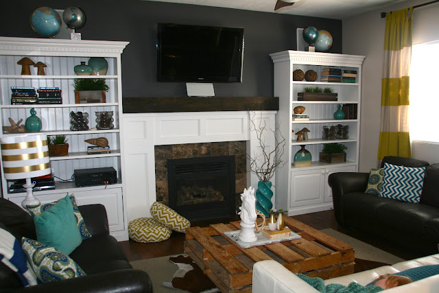
This last weekend I painted the kitchen nook and a focal wall in the great room a deep charcoal grey color.


{don't mind "lil red" there takin' a snooze}
I love how it turned out. Charcoal grey is such a sophisticated color.
I find it interesting how the space feels brighter with this darker color on the walls. Not sure why that is...I imagine it might have something to do with the way the white shelves really pop against it now.
Anyway, now I'm on to my next project. This one involves painting a white wall {and a little extra sumthin-sumthin}. If you haven't noticed, white is all the rage right now and I am totally drinking the Kool-Aid. I think white rooms look so crisp and clean and open and bright and...
But it can get really overwhelming trying to hone in on just the right shade of white. There are so many different "whites" out there to choose from. So, I did a little homework and thought I'd share it with you just in case you were contemplating painting a white wall in your house too.
But it can get really overwhelming trying to hone in on just the right shade of white. There are so many different "whites" out there to choose from. So, I did a little homework and thought I'd share it with you just in case you were contemplating painting a white wall in your house too.
I narrowed down some choices of whites that are tried and true. I tried to include options from varying price points and easily accessible brands. Also, I've included the link to a great article I happened across on Houzz {I could go on and on about this website, but that's for another post} that addresses the topic of choosing the right white for your space.
#1
Creamy by Sherwin Williams
{SW7012}

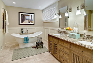
 It is a really cool and crisp white, but not so stark that you need to wear sunglasses when you look at it. Color shown in the wainscoating and trim below.
#3
Atrium White by Benjamin Moore
{PM-13}
This color comes highly recommended although I have never used it personally. It's described as being not too warm and not too cool, but just right.

#4
Dove White by Benjamin Moore
{OC-17}


#7
Swiss Coffee by Behr


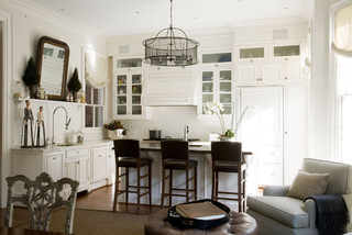
I used this color to paint my kitchen cabinets.
It doesn't look as off white in person as it does in the swatch above. It's just a deliciously warm, soft, white color. Color shown in the wainscoating below.
#2
Snowbound by Sherwin Williams
{SW7004}
I used this color on the doors and trim in my house.
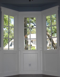
#3
Atrium White by Benjamin Moore
{PM-13}
This color comes highly recommended although I have never used it personally. It's described as being not too warm and not too cool, but just right.
Color shown on the trim below.
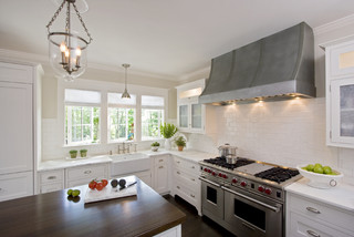
#4
Dove White by Benjamin Moore
{OC-17}

Color shown below
This is another white that comes highly recommended. It is the perfect neutral white...not too gold and not too gray.
#5
Anthem White by Valspar
{7006-24}

#6
Decorator's White by Benjamin Moore
{CC-20}

Decorator's White by Benjamin Moore
{CC-20}
#7
Swiss Coffee by Behr
Something to bare in mind when choosing a white, is to consider the style and aesthetic of the room whose walls are being painted. You might also take into account the overall aesthetic of your house. If you lean towards a more modern aesthetic, you might steer clear of warmer,
antique-y, off-whites and choose a "newer", crisper white. The same would go for an older home. A bright stark white wouldn't look as good as a warmer, "aged" white.
As for me, my home is neither modern nor old, it's somewhere right in the middle. So, I've decided to go with a perfectly neutral white.
Here's to hoping I've chosen, white-ly, I mean wisely. :)
No comments:
Post a Comment
I love it when people leave comments, but please keep your spam to yourself. Spam scares me.