Wednesday, August 19, 2020

What's black & white and cool all over?

My new bathroom...that's what!!!

But, before I say anything more, I guess I should address the proverbial "elephant on the blog"...which is, where the crap I've been?  And my answer to that is simply, no where.  I haven't been anywhere, or been doing anything earth shattering.  I just decided to simplify my life for a spell, and enjoy just being a mom and wife for awhile...without any distractions.  And it was marvelous.  BUT, that doesn't mean that I didn't miss spending time on my blog, or that I stopped finding projects for Studs and I to do around the house.  Quite the contrary, actually.

 Studly and I took on the project of finishing our basement during our time apart...all 1,350 square feet of it.  While we delegated most of the work to our contractor, we took on the project of doing all of the finish work in the new bathroom ourselves.  And I love how it turned out.  It might almost, probably, definitely be my favorite room in the house.  Wanna see the finished project?  


I knew before we even started finishing the basement, that I wanted a black and white bathroom.  I knew that I wanted to keep the walls crisp and white...since there are no windows or natural light in the space.  But, I didn't want plain, white, painted walls.  The perfect solution was to tile the walls from floor to ceiling with penny tile.  The walls are still bright, but with a little added texture and interest.  And let me just say for the record, that grouting penny tile, let alone walls and walls of penny tile, is not for the faint of heart.  But man, it looks so good when it's all said and done.  It might have even been worth all of the sores and cuts my poor, fingers and hands endured throughout the process.  

Yeah, yeah, I know there is a little invention called gloves that can prevent these sorts of mishaps.
But as I mentioned earlier,  all of the blood, sweat and sores were worth it in the long run, cause I freaking love my new bathroom.  

After a little thought and consideration I determined that I wanted dark floors and dark grout...this stems primarily from a cleaning standpoint...more specifically, my disdain for cleaning grout standpoint.  And with the bathroom just off of the new playroom, I did what any sane person would do and opted for the blackest grout possible.  Narrowing down the tile options for the floor proved to be the toughest decision.  Have you seen some of the amazing black and/or white tile out there?  Here a few tile options that were in the running.


But when it was all said and done, I decided on these delicious, black hexagon tiles in a matte finish.


As I said, we opted for black grout with the black hex tile.  Not only will it be easier to keep clean, it looks really chic and classy.


Although I love everything about the bathroom (mostly the fact that it's done and we finally have a fully functioning bathroom in the basement) one of my favorite things is this wood vanity.  Studs and I made the vanity out of  a wooden cabinet we found on clearance for $50.  I picked up some stainless steel legs at Ikea, $12.99 for a pack of four, and also some stainless steel pulls , $6.99 for a pack of two and attached them very quickly and easily.  We were also able to find a remnant piece of granite for the counter top. I think we ended up spending $400 total after fabrication (having it cut to size and holes drilled for the faucet and drain).  The sink and faucet were Home Depot finds and cost just under $300 for the set.  In total, we ended up spending less than $500 for the entire vanity (minus the cost of the faucet and sink).  I priced out modern style vanities online, and this DIY version came in well under what we would have spent for a prefab one.  And truth be told, I think I like my little DIY version even better anyway.


Monday, June 20, 2016

Can I get a "Pfister" bump?

I was recently contacted by Pfister to try out one of their kitchen faucets and to let them know what I thought of it.  I thought I'd also go ahead and share my findings with the masses...cause I'm a giver.

Here's the faucet up for review:


As a DIY'er, there are three key elements I always keep in mind when I am about to embark on a new project.

Cost, Quality and Appearance.

COST.  Listen, I love nice things, but I have five kids...one of which is preparing to go to college in the fall, so I have to be very deliberate about how I spend my money.  I need an affordable product that won't require me to sell any of my beloved organs in order to pay for it.  This particular faucet retails for about $100...which in my opinion is fairly budget friendly.

QUALITY.  This goes hand in hand with number one.  As I mentioned prior, I need an affordable product that won't break the bank, but I also need that product to be good quality.  Even though I am reviewing a Pfister product, I am not obligated to "sing it's praises".  That being said, Pfister is a brand I am familiar with...it's a brand that I trust, so I am hopeful that the product I'm reviewing today is of decent quality and will hold up over time.

APPEARANCE.  Call me superficial, but I want a product that not only works great, but also looks great.  I like things to be swoon worthy...like, the guy from Poldark swoon worthy.  This particular faucet was fairly basic, but perfect for our basement kitchen.  The only way it could have been any more attractive is if it burbled the phrase "hello darling" when the handles were turned...all the while spewing delicious, clear H20.

In all transparency, I did not attach the faucet myself.  I gave Studly that honor.  But when I asked him how he would rate this particular faucet...he pretty much gave it a two thumbs up.  It fulfilled everything on our checklist, plus was easy to install in addition.  From start to finish the project took only about an hour and that included removing the old kitchen faucet.

Here's a picture of everything you need for installation:
 plumers tape, plumbers putty, fixture, and wrench


Again, in full transparency, the faucet hasn't been installed for that long, so it remains to be seen how well it holds up over time.  But as I mentioned before, Pfister is a brand that I am familiar with, so I confident and comfortable it will perform up to our standards.


Here are a few before and after pics, just in case you were wondering.

Before:


After:


Monday, March 30, 2015

Mad Men inspired...

Mid century modern style has made a huge comeback, due in large part to T.V. shows like Mad Men. The style back then, was clean and simple, juxtaposed with pops of color and patterns; the perfect balance.

It isn't hard to create the perfect modern day- mid century modern space.  The key is to look for pieces that are timeless and classic...that will never go out of style and will integrate easily with pieces you already have.

I was contacted by the people at chairish.com to design a Mad Men inspired, mid century modern space.  If you aren't familiar with chairish, it is a huge, online consignment marketplace where those of us who love design can buy and sell gently used, pre-owned pieces...or just browse...for hours...and hours...like I did.

After...hours, of searching their website, I whittled down my top choices of must have pieces to the handful you see below.

I've created a collection of mid century modern pieces, that will translate perfectly into a current and relevant living room space.  The pieces can stand on their own, or can be mixed in with contemporary pieces just as easily.


There's something about this "room" that makes me want to pour myself a martini {and I don't even drink}, turn on some tunes and put my feet up and relax.

The pink sofa was a no brainer.  That girl is just plain gorgeous.  And the marble coffee table is like a piece of artwork.  Every room needs something earthy to warm it up and ground it; cue marble coffee table.  The turquoise chairs are just fun and add a much needed pop of color, while the gold accents add a little bit of glam.  The picture is the final touch and ties the whole room together.

Tip of the day:  visit chairish...like now!  You'll thank me later.  Whether your new to the mid century craze, or as "mad" about it as I am, you'll love looking at all of the beautiful things just waiting for a new home.


Wednesday, September 10, 2014

Zillow Guest Post...5 Colors that Optimize Living Spaces


Hello Friends!
It's been awhile.  I hope you don't mind that I took the summer off to spend time with the kiddos.  To Studly's chagrin, projects are back in full force.  I can't wait to show you my most recent endeavor...the upstairs bathroom.  It's a tricky little spot because it doubles as both the kids bath and the guest/company bathroom.  I've had a good time trying to make it fun and whimsical for the kiddos but also sophisticated enough for any visitors.  And unlike our last bathroom reno, this one was all DIY...as in, I did almost all of  work myself.  It's not quite complete, but should be finished within the next week or two.  I can't wait to show you the final product.
In the meantime, I was contacted by Zillow to host a post.  If you aren't familiar with Zillow, it is an online real estate data base that provides information and tools for the average joe like you and me, to make smart and educated decisions about homes and real estate, etc.  The've also got a fantastic link that provides oodles of ideas and inspiration for whatever home improvement project you are working on.  It's definitely worth checking out.

If you are considering updating a room or doing a complete reno, this post has some valuable information on choosing the right color.  What I liked most is that while most of the color suggestions are ver current and very in, they are also very classic and will stand the test of time.  So, without further ado, I turn the time over to Jennifer Riner.  Thanks Jennifer.

And, I'll see you back here soon with my bathroom reveal and some other good stuff!


5 Colors that Optimize Living Spaces
By Jennifer Riner of Zillow

Homeowners strive to optimize the size and layouts of the rooms in their homes to use their spaces at their fullest potential with the greatest possible luxury. However, some colors and styles ruin a space’s design with overly ornate, bright or distracting finishes. Living space designs require extra caution, as homeowners must appeal to residents, guests and future homebuyers.
Remaining stylish yet neutral can be complicated. Rather than selecting safe, bland beige, consider the following five hues for chic living rooms.


1. Dark Gray
Source:  Highlight Builders

Charcoal tones are trending in the design world because they warm interiors without appearing gaudy. Beige is the previously trendy warm neutral that’s now considered “builder-grade” and dated, particularly due to its prominence in homes for sale throughout the United States. When painting with gray tones, purchase flat paint instead of semi- or high-gloss alternatives to avoid overly shiny and metallic walls. Further, consider cream-colored trim rather than stark molding for a softer contrast. Additionally, avoid overhead fixtures as they tend to cast shadows on walls creating darker spaces. Multi-level freestanding lights brighten up dark gray walls suitably.

2. Bright White
Source:  Zillow

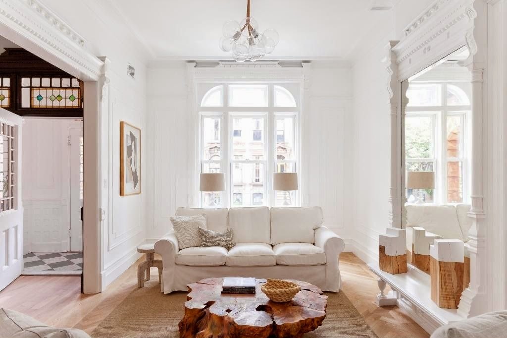
White seems like an easy go-to wall color, but selecting unique, elegant shades of white is tricky. Designers and homeowners have hundreds of white paint possibilities ranging from elegant to standard white. Some of the most popular preferences include Benjamin Moore’s “Linen White,” Sherwin-Williams’ “Dover White” and Valspar’s “Du Jour.” Sticking to neutral color palettes is always beneficial, especially when residences aren’t fully furnished quite yet. Further, white paint has widespread appeal and won’t deter homebuyers in the future.


3. Deep Blue
Source:  Paola McDonald

Navy blue is a strong hue that adds stateliness to interiors. It’s best to let it stand on it’s own or with a few other complementary shades, such as white or yellow. For a nautical vibe, incorporate navy and white as chief colors and showcase reclaimed wood furnishings and wall décor. If dark blue is too intimidating as wall paint, use it as an accent color for furnishings and keep the walls a neutral, light gray or white. More advanced designers might paint the ceiling a plain or patterned blue hue for enhanced visual interest.


4. Soft Yellow
Source:  The Corcoran Group

Homeowners sometimes shy away from yellow in their living spaces, escaping the stereotypical overly bright, tacky and overwhelming designs. Soft yellows, though, are great for adding vibrancy and flair to any room – especially where socialization is key. Yellow is surprisingly versatile and can match existing color schemes easily, so complete redesigns aren’t necessary. Complementary colors include blue, green, light brown and black, all used in moderation.


5. Accent Red
Source:  DAS Studio

Most homeowners won’t dare paint their entire homes red – and rightfully so, as red overwhelms small spaces and intimidates guests. Rather than omit altogether, use red in moderation. Paint built-in bookshelves a bright red hue to cover one wall of a living space. Or, sew a few throw pillow covers with fun red fabrics to display throughout the room. Red is bold and energizes interiors if applied in small amounts. Focus red on either one wall or a few accents to avoid completely overpowering interior design schemes.
Selecting suitable wall colors is never an easy process, but luckily mistakes can be remedied with primer and fresh coats of paint. Experiment wisely, as multiple layers can ultimately waste valuable time, money and energy.