Friday, August 31, 2012

When too much excitement takes its toll.

So, it appears that all the excitment from the past few weeks has finally caught up with me...in the form of shingles. 

All right, everybody stop laughing, I'm being serious.  Apparently my thirty five year old body thinks it's eighty-five instead.  I have an itching, burning rash on my neck and shoulder to prove it {I'll forego the gruesome pictures, but if you're curious, just google shingles}.  Not to mention that I feel like have a major case of whiplash. 

Anywho, I guess what I'm trying to say is, mama's taking a break from the ole bloggy for the long weekend to rest up.  Hopefully, my be-shingled self will feel better come Monday.  In the meantime, you all have a safe and pleasant Labor day.

I'm off to change my Depends and grab an ice cold glass of prune juice.  See ya next week!!!


Wednesday, August 29, 2012

Biding My Time aka. It's All In The Details-Part Deux aka. Things To Do While My Demon House Lashes Out

So while I'm waiting for the bid to come in on the work that has to be done in the basement, I've decided to catch up on a few more little projects.  I think if I tried to start a big project right now I'd probably have a nervous breakdown...and mama don't need that.  Here are a couple pics of my deconstructed basement.


The damage wasn't horrible, but because it was poo water, everything has to be ripped out...but enough about that for now.

All of the kiddos bedrooms are mid renovation...I've started on them, but haven't totally completed them. 

In the nursery/little kiddies room I've been using this green, mid century style nightstand for awhile. 
I love the style and shape of it, but I'm not really feeling the green anymore, so I thought now would be a good time to work off some nervous energy by giving it a fabulous make over.
{Once upon a time, the thought of stripping the paint of furniture used to rank right up there with the notion of moving...arduous, time consuming, and a major pain in the neck.  But I soon realized that it's not as bad as it's been made out to be.  In fact, I actually enjoy stripping paint.  There's something very satisfying about removing old paint to reveal something beautiful and natural that's hiding underneath.  It's like...finding buried treasure...except without the little bowl and strainer thingy.}

I started by stripping the paint off of the drawers. 


I really love the aesthetic of paint and natural wood together.  Some of you may remember the dresser I revamped recently for my daughter's room.

I particularly love the combination of white paint and wood.  I think it's super classy and sophisticated.  But, since this nightstand will be going into a nursery/kiddie room, I wanted to make it fun.  I opted to use turquoise paint instead {Krylon's Ocean Blue is my go to}.
After all of the paint and old top finish was removed I cleaned the wood with Afterwash{available at any home improvement store}.

Then I stained the wood

and applied a couple coats of wax to seal and protect it. 
I love wax.  I haven't done that much research in terms of how it holds up compared to a polyurethane/polyacrylic sealer, but I much prefer to work with wax.  It's so much easier, and if you find a citrus wax...it's also smells better.  And as an added bonus, the finish on the wood looks so much more natural.

Here she is now.  No too shabby, eh?  I like the little pop of blue in the room.


The other little project I completed was this little writing area in my daughters room. 
{note:  contact paper plus swamp cooler equals rolling and shrinking.  Oh well, at least I know that I like the wood look on that wall.  Just one more job to add the list}.
I've tried out several different chairs over the past little while, but just haven't been able to find the right one.  Then I remembered the cute little tree stump end table I purchased a few months ago and new it would be the perfect addition to the room...and it was-just the right fit for the space.  Done!

There are plenty more projects where those came from.  Good thing too, because with all of the shenanigans going on with the house lately, I could have bum loads of nervous energy to work off in the next little while.  Fingers crossed, though, that this demon house has finally been exorcised.


Friday, August 24, 2012

faux bois...not to be confused with fois gras

First order of bi-ness!  My house blows!!!  First the ceiling falls in...some of you may recall my "accidental skylight".  And today, the basement floods with all manor of stank water...aka. sewer backup.  If I hadn't already invested blood, sweat, tears and our 401K into the place, I'd probably walk away and never look back.  But, since our only other alternative would be to take up residence in a mini van...down by the river, I guess I'll just suck it up, along with all the poo water stanking up the basement.

Second order of business.  I just found out that my {diy flour poufs from $3 rugs project} is being featured over at knock-off decor.  It's a super awesome site totally dedicated to knock-off projects.  Love it!  So, if you love stuff that costs a zillion dollars but only wanna spend a few...head on over to knock-off decor to be inspired.  Thanks Becky!!!

Third order of bizness!
I love faux bois.  Not just love it...but like, loooove it.  It makes me giddy.  Who knew fake wood would complete me, but it does.

I've been looking for ways to incorporate this delicious {unlike the duck liver delicacy with a similar sounding name} pattern into my home decor.  I've considered wall paper...which I might still do

rugs
pb.jpg

throw pillows

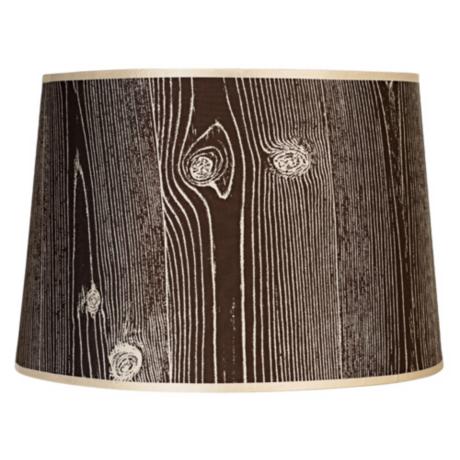
lamp shades {which I sorta already did here}

but settled on this super simple project for now...diy faux bois frames. 


I found the frames at the thrift store for $5 a piece.  They were thick, chunky and perfect for what I wanted to do. 

All I needed to complete the project was brown and white craft paint {or whatever colors you prefer...just make sure they are contrasting colors} and a stiff, thin bristled paint brush.

I painted the frame and let it dry.  Then with a contrasting color, I painted on my faux bois.  The best part about faux bois is that it is a pretty forgiving design.  It doesn't have to be perfect, to look perfect.  It took me about 15 minutes to paint the design on my frames.  I let them dry, then went over them with watered down brown paint to age them a little and lessen the contrast slightly.

I love how they turned out.  I have just the place for them.  Don't you just love projects that are quick, easy, cheap...but don't look any of the above?  Ya, me too.

Wish me luck in the meantime.  Fingers crossed nothing else goes wrong with this place...at least until the basements put back together. 


Wednesday, August 22, 2012

Let's Play

Howdy peeps!  Long time, no post. 

I have a super fun, super easy project to share with you today, but first let me start from the very beginning.  Oh don't roll your eyes- I'll be brief...ish.

A few weeks ago, I was contacted by DecoArt and asked to try out some of their gloss enamel paint.  I am always game for trying out new products, so I happily consented. 

This particular paint comes in several different finishes:  transparent, opaque, glitter, frost, crystal...  It is ideal for use on porcelain and glass and is now available at your local Michael's craft store.

Initially, I'd planned on upcycling an old porcelain platter or lamp base to test the paint out on, but once I started working, I just wasn't feeling it.  Truth be told, I can't paint worth crap!  I mean, I can paint...if it involves a roller or a spray can.  But my artistic abilities stop beyond that.  Needless to say, I was a little intimidated because of my nonexistant decorative painting skills.  I can honestly say now, having completed my project, that this product is perfect for diy'ers/crafters of varying artistic abilities and backgrounds.
{For glass inspiration, click here, DecoArt Glass Paint., DecoArt/Pinterest }
 
I decided to put the project aside and let things stew for awhile to think about what I wanted to do.  A few days later it donned on me...at 3 o'clock in the morning. {I'm not certain why, but some of my "brightest" ideas [though Studly would beg to differ] come to me during the stills of the night.  Perhaps it has something to do with the fact that it is the only time the house is quiet and I can actually entertain a focused thought.  But whatevs.  Needless to say, I was a little groggy when inspiration struck, but thankful the idea remained when I woke up a few hours later.  And that idea was to create the flippin' coolest "game station" ever. 

Okay, stay with me. 

Awhile back, whilst meandering through Ikea's dented and dinged section, I came across a cute, little glass top table...similar to this one.  I nabbed it not knowing for sure what I would do with it.
36611_pe127836_s4_1
I ended up using the two bases as end tables and stashed the glass table top away out in the garage. 

I was relieved to find it still there and that Studly had not tossed out behind my back.  I brought the glass top inside and got to work. 

I prepped the surface by wiping it down with a damp cloth then drying it off with a clean, dry, lint free towel {Rubbing alcohol can also be used to prep the work area}.  After the surface was properly clean and dry, I used a dry erase marker to sketch out my "game plan".


When I was satisfied with the design, I went over it with the DecoArt 3D gloss enamel, glass writer. 

I strategically painted the squares with some transparent, gloss enamel {in turquoise}.

And that was it.  Game over.


After the paint had cured for 48 hours, the fam got to work testing out the new "game table". 


We are a game loving people in these parts, so naturally we are thrilled to have a space designated solely for playing games.  The kids have really taken to it...as you can see.

For the older kids...checkers and chess were a must. 

The pieces are "thrifty chic"...pop bottle caps in contrasting colors.

For the younger ones...tic tac toe. 

Again, with "thrifty chic" game pieces.  I simply painted old canning lids with chalk paint and drew on the circles and exes with chalk.

I decided to also throw in a built in Connect Four


and dots station for good measure. 

Who can resist a rousing game of dots?  I know I can't.

And when everyone is finished playing...the pieces are simply stashed away in the totally recycleable/green game caddy...otherwise know as a cardboard pop bottle carrier painted with chalkboard paint. 

Tres chic.  Or should I say...trash eek?

If no one is in the mood for a rousing game of tic tac toe or chess the space can still be used for {insert board game/card game of your choosing}.

So, if you happen to have an old glass topped end table, kitchen table, coffee table, patio table, old window or random piece of extra panel of glass lying around...don't toss it out.  With little effort and little cost you could have your own fabulous game table.  You might be surprised at the hours of fun {and possibly the occasional fist fight} it will provide.  Game on!   


Wednesday, August 15, 2012

It's all in the details.

Since I got home from my trip to Cali I've been busy with several small "jobs" around the house.  It dawned on me, that having a new project in the pipeline oft times results in me moving on to the next thing before totally completing the thing before.  And because I am hosting a couple of gatherings at my home in the next few weeks, I figured now was as good a time as any to address some of these smaller, yet equally as important, details around the house. 

Studly just rolls his eyes.  He thinks I'm wasting my time, but I guess I can't expect a man to understand the notion of "it's all in the details".  A curtain is a curtain, a picture frame is a picture frame, and a rug is a rug, etc. etc. 
Women know that isn't completely true...at least when it comes to decorating the home.  Attention to details is what can separate a good design from a great design. 

I decided to start with my entry way, since it's the first thing everyone will see.  I love my entry way.  Ever since painting the front door with a chevron stripe the space has a renewed energy and life.


But it all sorta stopped there.  I finished painting the door and moved onto the next thing, leaving the accessories and all the fine details unfinished. 

I decided to rectify that by adding some bright, patterned, throw pillows to the bench on the left to add a punch of color and interest. 

On the right, I paired a cermaic horse bust with some brightly bound books and set them atop an old garden stool that I wrapped with hemp rope.


I found an inexpensive, flatwoven throw rug at Ikea for $20 which I added to help ground the space.


Here's how it all looks put together. 
In the kitchen/living area, I wanted to brighten up the walls so I decided to paint some bold, thick stripes on all of the curtain panels {Behr's Leapfrog}.  Before, the curtains {$20 at Ikea} were very neutral/very cream and were invisible on the wall.  The little splash of color on the wall now adds just the right amount of interest and energy to the space without detracting from the serene color palette. 


The rug I replaced in the entryway was painted {low pile and flat woven rugs are perfect for painting and repurposing just in case you were wondering} and repurposed in the bathroom.  I love it when I can reuse something.  I love it even more when it turns out better than it was in the first place.  The rug before was an inexpensive runner from Ikea.  It had become really dirty and stained from a constant flow of traffic.  I found some white paint lying around a gave the rug a couple coats.  After it was dry, I painted on some thick stripes in a tan color.  And voila.  A new, chic rug for free.  I love it in the bathroom. 

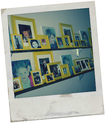
Lastly, I addressed my new photo gallery wall.  I still love walking by all of the photos and being reminded of how cute my little darlings were before they developed their sass{just kidding...kinda}.  But, there was something about the gallery that I bugged me.  I finally narrowed it down to the frames.  While I enjoy the "collected over time" look...usually, my frames were just a little too hodge podgey for me.  I couldn't enjoy the photos without obssessing over all of the mismatched colors and styles of the frames.  So I decided to paint them all one color...to unify them and add cohesiveness.  I went a little crazy with the yellow, but I wanted to add some color so I went with it.  Who knows, they may be a completely different color next month, but for now we will just enjoy the sunshiney yellow.
It's such a good feeling to get all of these little projects out of the way.  I know they weren't earth shattering or ground breaking ideas, but they haven't gone unnoticed. The best part was that they were relatively inexpensive and easy changes that have significant impact.  Sometimes it's the small, simple things that make all the difference. If you are feeling like your home needs just a little something something extra, try addressing some of the details...a new rug, colorful lamp or throw pillows in a cool pattern might be all your space needs to take it from good to great.