Showing posts with label painting. Show all posts

Wednesday, April 24, 2013

Which white is right?

I've been trying to bang out a couple of little projects around the house before Studs and I head out on our vacay next week.  

This last weekend I painted the kitchen nook and a focal wall in the great room a deep charcoal grey color.

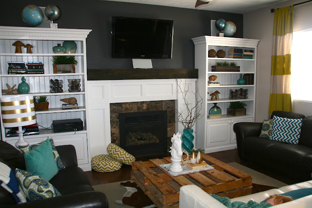
{don't mind "lil red" there takin' a snooze}

I love how it turned out.  Charcoal grey is such a sophisticated color.

I find it interesting how the space feels brighter with this darker color on the walls.  Not sure why that is...I imagine it might have something to do with the way the white shelves really pop against it now.  

Anyway, now I'm on to my next project.  This one involves painting a white wall {and a little extra sumthin-sumthin}.  If you haven't noticed, white is all the rage right now and I am totally drinking the Kool-Aid.  I think white rooms look so crisp and clean and open and bright and...
But it can get really overwhelming trying to hone in on just the right shade of white.  There are so many different "whites" out there to choose from.  So, I did a little homework and thought I'd share it with you just in case you were contemplating painting a white wall in your house too.

I narrowed down some choices of whites that are tried and true.  I tried to include options from varying price points and easily accessible brands.  Also, I've included the link to a great article I happened across on Houzz {I could go on and on about this website, but that's for another post} that addresses the topic of choosing the right white for your space.

#1
Creamy by Sherwin Williams
{SW7012}
I used this color to paint my kitchen cabinets.  

It doesn't look as off white in person as it does in the swatch above.   It's just a deliciously warm, soft, white color.  Color shown in the wainscoating below.

#2
Snowbound by Sherwin Williams
{SW7004}

I used this color on the doors and trim in my house.  
SHERWIN-WILLIAMS SNOWBOUND 7004
It is a really cool and crisp white, but not so stark that you need to wear sunglasses when you look at it.  Color shown in the wainscoating and trim below.

#3
Atrium White by Benjamin Moore
{PM-13}
This color comes highly recommended although I have never used it personally. It's described as being not too warm and not too cool, but just right.

Color shown on the trim below.

#4
Dove White by Benjamin Moore
{OC-17}


Color shown below
This is another white that comes highly recommended.  It is the perfect neutral white...not too gold and not too gray.

#5
Anthem White by Valspar
 {7006-24}
#6
Decorator's White by Benjamin Moore
{CC-20}

#7
Swiss Coffee by Behr


Something to bare in mind when choosing a white, is to consider the style and aesthetic of the room  whose walls are being painted.  You might also take into account the overall aesthetic of your house.  If you lean towards a more modern aesthetic, you might steer clear of warmer, 
antique-y, off-whites and choose a "newer", crisper white.  The same would go for an older home.  A bright stark white wouldn't look as good as a warmer, "aged" white.
As for me, my home is neither modern nor old, it's somewhere right in the middle.  So, I've decided to go with a perfectly neutral white.  

Here's to hoping I've chosen, white-ly, I mean wisely.    :)


Friday, July 6, 2012

Shut...err, Paint the Front Door

I've been a little agitated lately...presumably because my bathroom looks worse now than it ever did before and I haven't been able to enjoy my ritual of soaking in a hot, soapy bath whilst catching up on celebrity gossip for over two weeks.  I know it may not seem like a big deal to some, but I have come to rely on this little routine for maintaining my sanity. 

Yesterday, whilst changing out the laundry, I realized that my laundry room...though newly revamped and still totally awesome, was is need of a little color punch.  In an effort to relieve some built up stress I decided to paint the door.  And while it was no soak in the tub, it did offer my mind a few moments to forget about the "pit of despair" {aka. my bathroom} for a good forty-five minutes and concentrate on less "moldy and messy" issues such as...which cupcake flavor is my favorite- strawberry shortcake
or salted caramel...an internal debate I constantly battle.  Forty-five minutes was nowhere long enough to come to a decision, but was more than enough time to work up a nearly uncontrolable cupcake craving.

Here's what the laundry room looked like before...that mass of white on the left is just begging for some color dontcha think?
 

And here it is now with a buttery, yellow door... does it remind you of delicious, lemony frosting or is it just me?


It's funny how something as simple as painting a door can change the whole mood of a space.  The yellow door in the laundry room makes it feel much brighter and cheerful...which could come in handy, especially on the days I find myself trudging through mounds of stinky, dirty laundry.

If you have a space in your house that could use a little something extra in the area if color, why not consider painting a door in a fun, bright hue. 


Friday, September 3, 2010

Kitchen Facelift

Okay, this post is for all of you d.i.yers who have toyed with the idea of painting your kitchen/bathroom cabinets but have been too scared to.

A year and a half ago the fam and I moved to a new house. We have been slowly renovating her and welcoming her to the 2000's. (She was just a little outdated, grapevine wall paper, pink counters...gah.) Of all the renovations, the kitchen has probably been our biggest transformation.

The bones were there...good, solid oak cabinets, but a little "1980's" and definately a lot blah.

I knew that I wanted to paint the cabinets white. As much as I enjoy look of wood, the cabinets and floors combined were a little too much.


That's Avery...eating a bowl of cereal.

I started the process by taking the doors off in sections. I figured if I did a little at a time I wouldn't feel quite as overwhelmed. I bought all of my paint and primer at Sherwin Williams. I would totally recommend the products I used. It was a little expensive, but worth every penny. Besides I only ended up needing a can of each...primer and paint. (The primer I used was called Adhesion Primer. The stuff is freaktastic. It creates an awesome foundation for the paint to stick to. The paint I used was designed specifically for doors and trim. It's called ProClassic and it dries super hard so there's no need to apply a protective coating. BONUS!)
Here's what it looked like after my first section was done.


My kitchen cabinets were quite plentiful, so I ended up painting about four different sections over the course of two or three days. I would paint and then reattach my doors as I went along. (I actually rolled the paint on with a small door/trim roller. This technique helped the paint go on nice and smooth and even.)

Once I had all of the cabinets painted I reattached them, then added hardware. Adding hardware, in my opinion, can drastically change the look of your cabinets alone. But, if you decided to paint and change hardware you can make your kitchen look completely transformed.

And look, when you turn them upside down they make a smiley face...which is exactly how they make me feel every time I look at them.

Here she is finished.

Before :(


After :)


I ended up spending $50 on primer, and $50 on paint. I bought 28 knobs for my cupboards and 14 pulls for my drawers and spent just under $300 on all of the hardware. That's a grand total of $400.
When I called around for bids, the lowest one came in at $3,000. By doing it myself, I saved $2,600...BOO-YA.
So...if you're thinking about giving your kitchen a facelift, I say do it. It's not as hard, scary or expensive as you think.

Linking to:

Funky Junk Interiors

Friday, August 27, 2010

Old Bi-fold turned Partition Reveal

Okay, so remember these bad boys?

I picked 'em up at the D.I. for $20. Maybe a bit pricey once you factor in the price of paint and primer etc., but I had beeen waiting and waiting ever so long for them so I popped on 'em.
The poor things were covered in mummified spiders and pet hair...ick.

But, I saw through the cobwebs and knew that they had great potential. After a thorough rub down, I primed them.

I didn't take a picture. But I only wanted to use three of the four panels, so I unhinged one set and used that hinge to attach the third panel to the other set of two. I did this after they were primed, but before I had started on the painting...so I didn't mistakenly knick up the paint.
After they were primed and hinged together, I sprayed black paint everywhere I wanted it to show through. I used my candle wax method (which you can learn about here.
I could have spray painted the whole project black, but I knew where I wanted the black paint to show through so I just spot painted instead.)

Then I waxed over all of the black areas with an old candle I had on hand. I know it's not pretty, but don't worry.

Then I sprayed on the top coat in my favorite color...Ocean Breeze by Krylon.

Then, I rubbed, rubbed, rubbed...where I had waxed.

Then glazed a little too...for good measure.

And voila...a cool, rustic partition; perfect for concealing clutter or spicing up a bland corner.

Here she is in her new home.


Just pretend those smudges on the front of the piano aren't there.

Linkin up to:
Funky Junk's Saturday Nite Special

Tuesday, August 24, 2010

Tutorial For Distressed Letters-Using Candle Wax

I know I mentioned something about decoupaging letters for my writing nook in my last post, but I decided to paint them using one of my favorite distressing techniques instead.
But first, remember how my "nook" looked before:

Looks pretty good, if I do say so myself. Keep in mind that I spent under $24 to create this little space.
That said, I felt like it still needed a little somthin' somethin'.
So, I decided to put letters inside the frames. I wanted them to look super old and weathered and I knew this candle wax technique would be perfect. I decided on the letters "e", "t" and "c"...an omage to my longwindedness, which I'm sure you've all realized by now.

I started by giving the letters a base coat of blue paint. Note that I used tole paint for this project. Generally I would use spray paint, especially for a bigger project, but since I didn't have the exact colors I wanted on hand (and becuase I was too lazy to run to the store)I used tole paint instead.

After the letters were dry to the touch, I scuffed them up using a little votive candle I had on hand (spiced cider scent optional :)) The wax is going to prevent the second coat of paint from adhereing to the letters, so bare that in mind as you are waxing up your project. If you do happen to get wax where you don't want it, you can wipe it off with a dry rag. In my opinion the more haphazard you are, the better it will turn out, so don't worry too much.


Next comes the top coat of paint. If you choose to brush paint rather than spray you need to be extra careful not to brush off all of the wax. I tend to prefer spray painting for this exact reason.

Once the top coat has thoroughly dried, wipe away all of the wax using a dry rag.

The base coat color with start showing through and reveal an awesome worn and weathered look of peeling paint.

I love how rustic they turned out.

And they seem to like their new home too.

I've actually used this technique on several larger projects.
My newly pimped out frame. You can go here for the how to.

And my bedroom dresser

I hope you try this technique out. It is super easy and the end result is always stunning and eye catching. Let me know how your projects turn out. Better yet, send me a pic or link to your blog. Good luck.