Howdy, bloggy peeps.
Couple of items I wanted to address this fine morning.
First, my tutorial on "painted floors-how to paint over tile" is up over at Lovestitched...just in case any of you were wondering about the ins and outs of it all. I teach you all about the appropriate paint and primer to get the job done. You'll essentially have your degree in Painting Floors 101 after you finish reading it. You're welcome.

Also, in other awesome news, I found a fun new photo editing website called picmonkey and spent, like, all day yesterday ingnoring my kids so that I could mess around on it. It is really user friendly and even better, it is super quick and easy to upload your pictures onto your computer. That is a big deal. Anyway, if you have 2-3-9 or 10 hours to spare to today, I suggest you head on over and check it out. All that being said, I have a question to throw out there.
How do you feel about "tricked out" pictures...especially on a blog?
Do you find them distracting and annoying, and would rather see a straight forward, simple picture that represents what's being discussed?
Or do you think that as long as they are not too crazy and don't compromise the integrity of the photo that they are a good thing and can add interest?
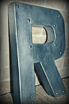
Take for example, my photo's at the beginning of the post. Is the polaroid effect too much? Don't worry you won't hurt my feelings. I am really curious to know how my peeps in Bloggyland feel about this topic.
All right. I guess that's all for now. Have a good one. I'm off to fold laundry...eh, who am I kidding? I'm off to "unecessarily" edit more pictures.


First of all, I love that letter R. Do you have a tutorial for that? For photos, I like a balance of the two, normal and then effects. I do think that there is a fine line though which makes it difficult.
ReplyDeleteKaylee. Thank you. That's kinda what I thought. It's fun to mix it up every now and again, but everything in moderation, right?
ReplyDeleteAs for the letter. Yes. I am planning on having a tutorial up for them this weekend.
when i read your tutorial for the metal letters, i enjoyed seeing unaltered pics. but then i got to this post and saw the polaroids and thought, ooh, i like that. it's different. haha, then read the rest of the post. you can definitely over do it...but the before and after polaroids are perfect!
ReplyDeleteThanks for your input Kim. I totally agree. You can go overboard, but I really dig the polaroid effect and may throw them into the mix now and again. I just love them too much not to.
ReplyDelete